This website uses cookies to improve your experience. We'll assume you're ok with this, but you can opt-out if you wish. .

Brand Design

Design

One of the biggest challenges for a company is how to communicate to their clientele.

Objective

From that experience, consumers decide whether to keep on doing business with the company or not. Branding represents the method which is utilized by companies to accomplish such a challenge. Once a brand is build properly, the company is able to impact their clients in a very positive way to create a win-win situation.

Sketch

It is very important to get to know the client to develop the profile which is better for him/her. To establish the rules and guidelines of the brand to take care of the corporate image. Due to that reason, it is important to create a brandbook.

Grid

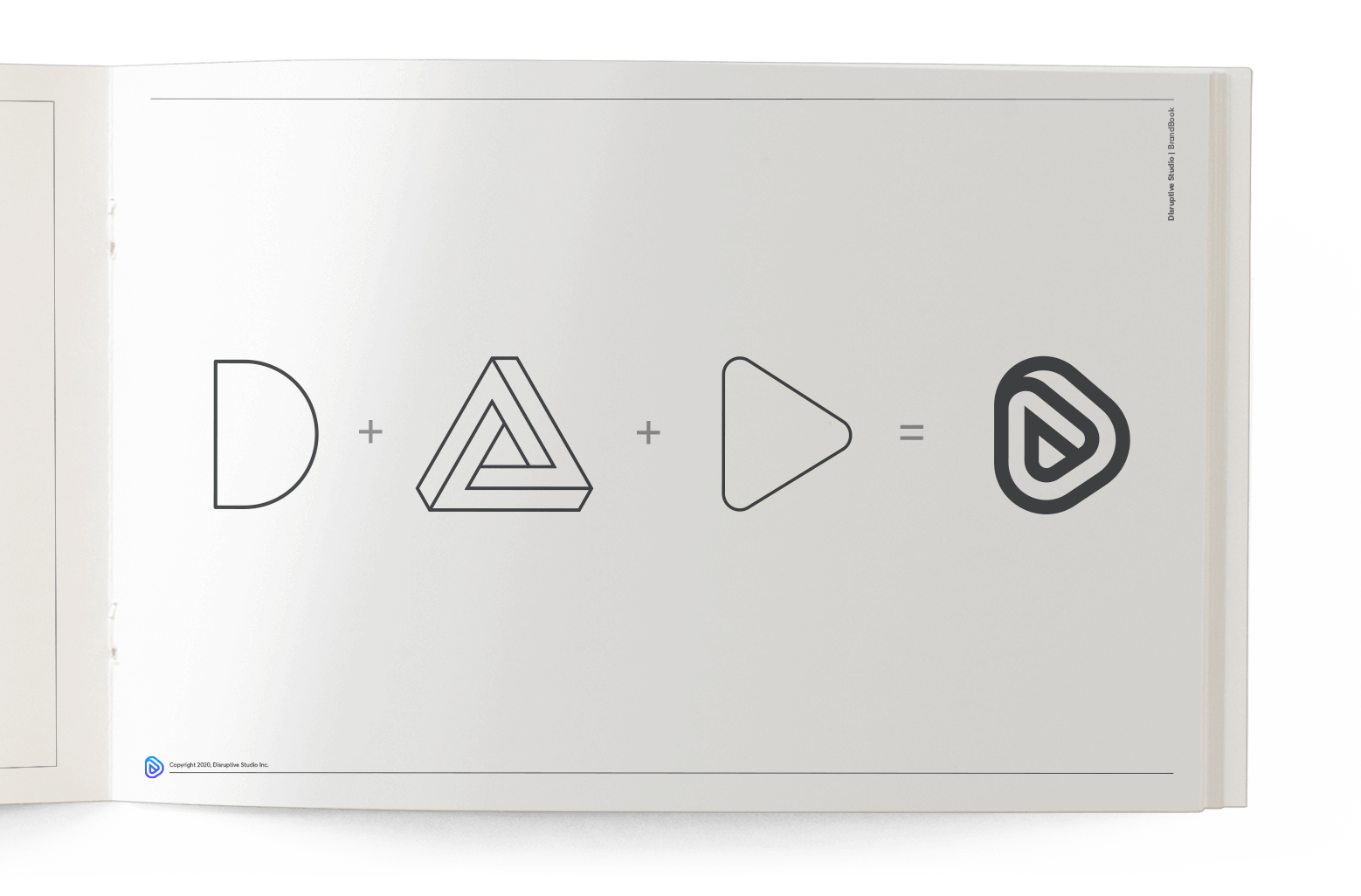
In this step, it is fundamental to take concepts and/or elements that identify with the company, to further digitize them in an iconic way

Color

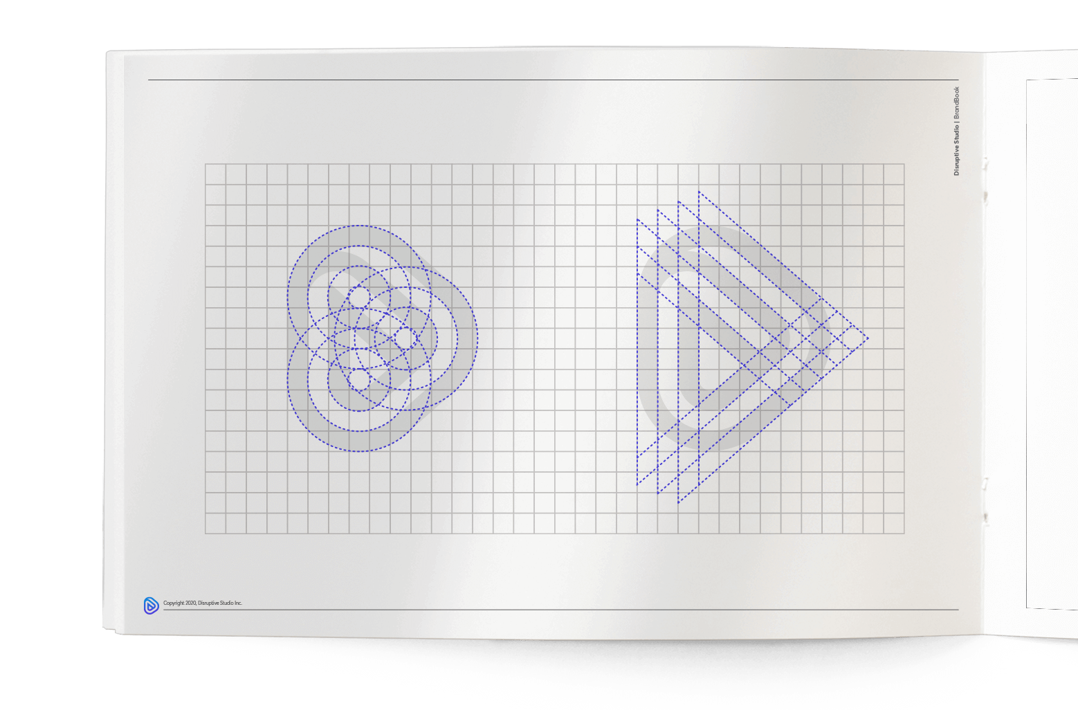
The grid becomes essential, to create in a proportional way all the elements within the design. Most part of the brand applications are resolved by the brandbook by respecting the spaces according to such a grid.

Correct use of color

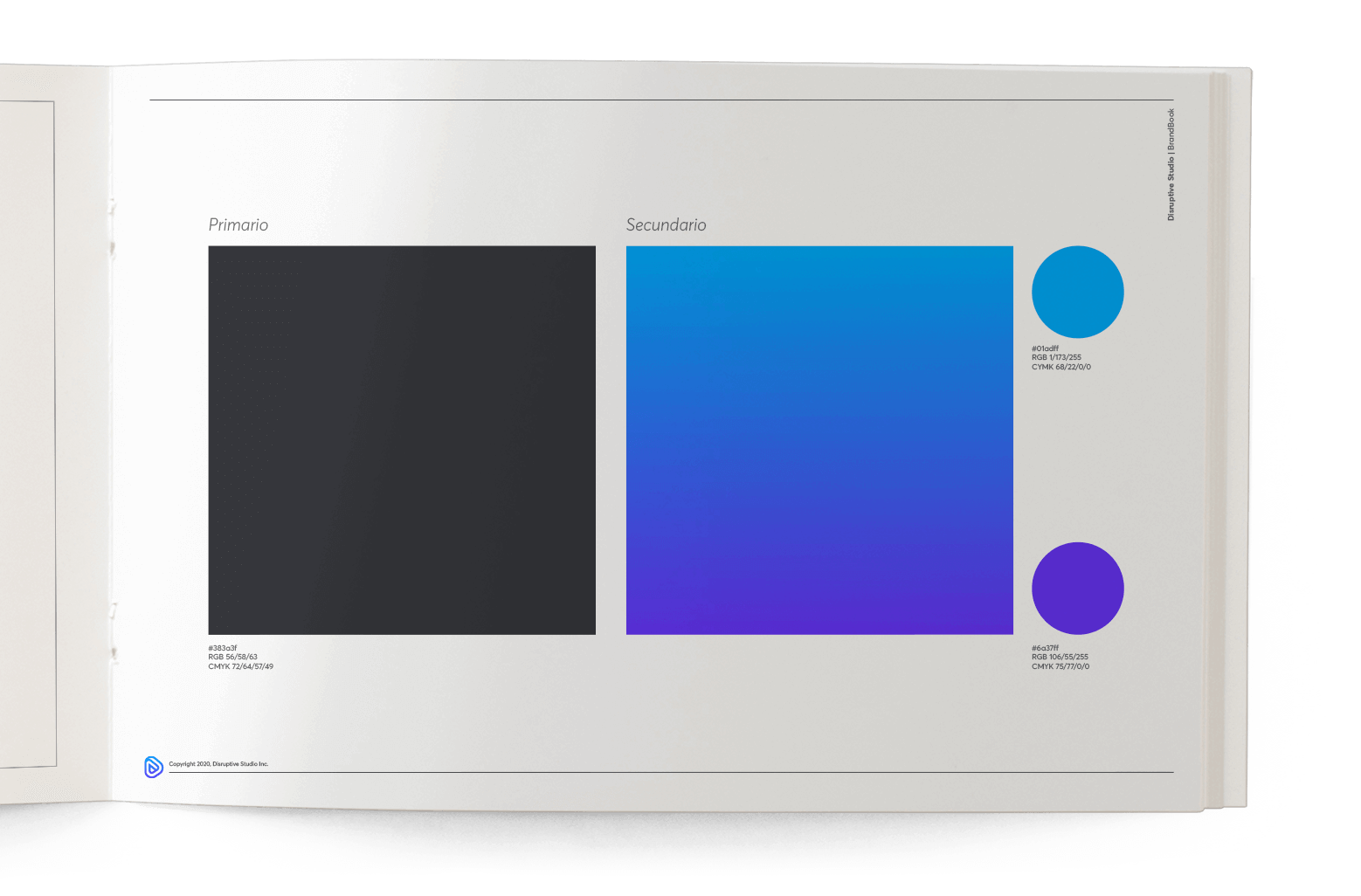
One of the main things about branding is to be able to choose the right colors for the company. Colors will be the first impact on the customer and must represent all the fundamental ideology of a company.

Inks and shades

It is important not to get confused on the signature, typography, isotype, to not lose visibility. To maintain a coherent brand, it is important to follow which colors can and can't be used.

Margin and space

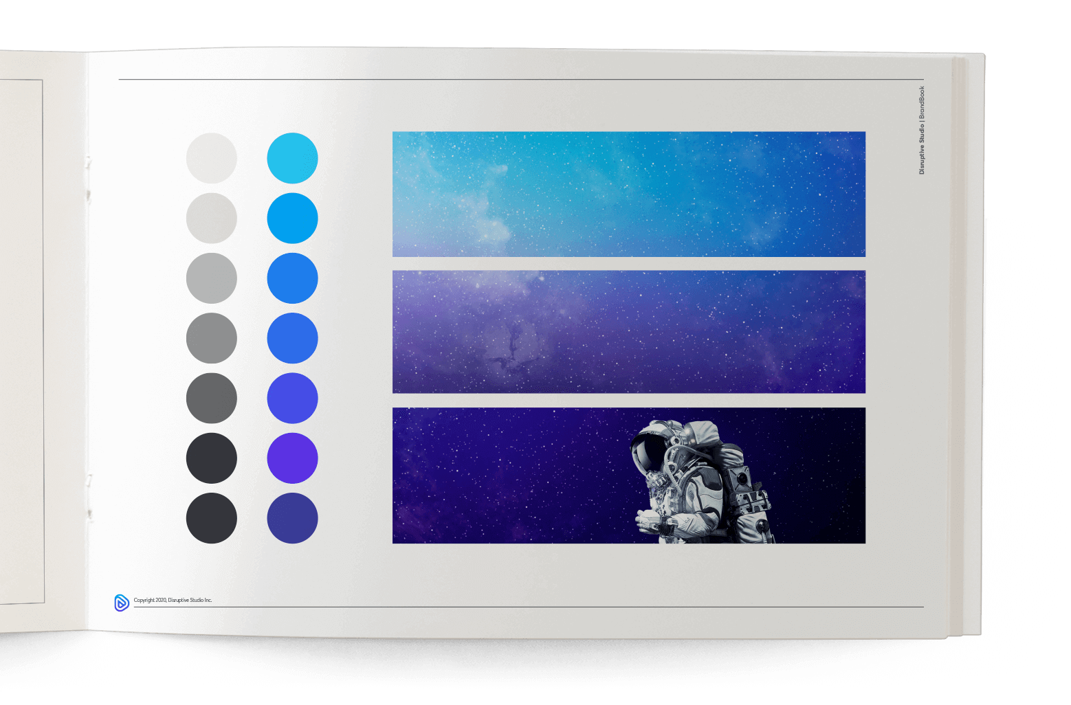
Tints are the mix of the brand colors over white, which increases luminosity. Tonalities are the mix of brand colors over black, which reduces luminosity. A tone is produced by the mix of gray colors or by tints and shadows, taking into consideration that tints and shade are different from color opacity.

Versions

To ensure the proper application and perception of the brand in all formats, it is determined by a secured area established by a minimum distance with respect to text and other graphical elements. The minimum size is established to not lose graphical elements within the artwork.

Correct use of brand

In some cases it is important to vary between a horizontal and vertical placement depending on the required use or surface.

Typography

There should never be a case in which the logo and or isotype can be distorted, its colors changed or replace, reflected, rotated, labeled and more.

Delivery

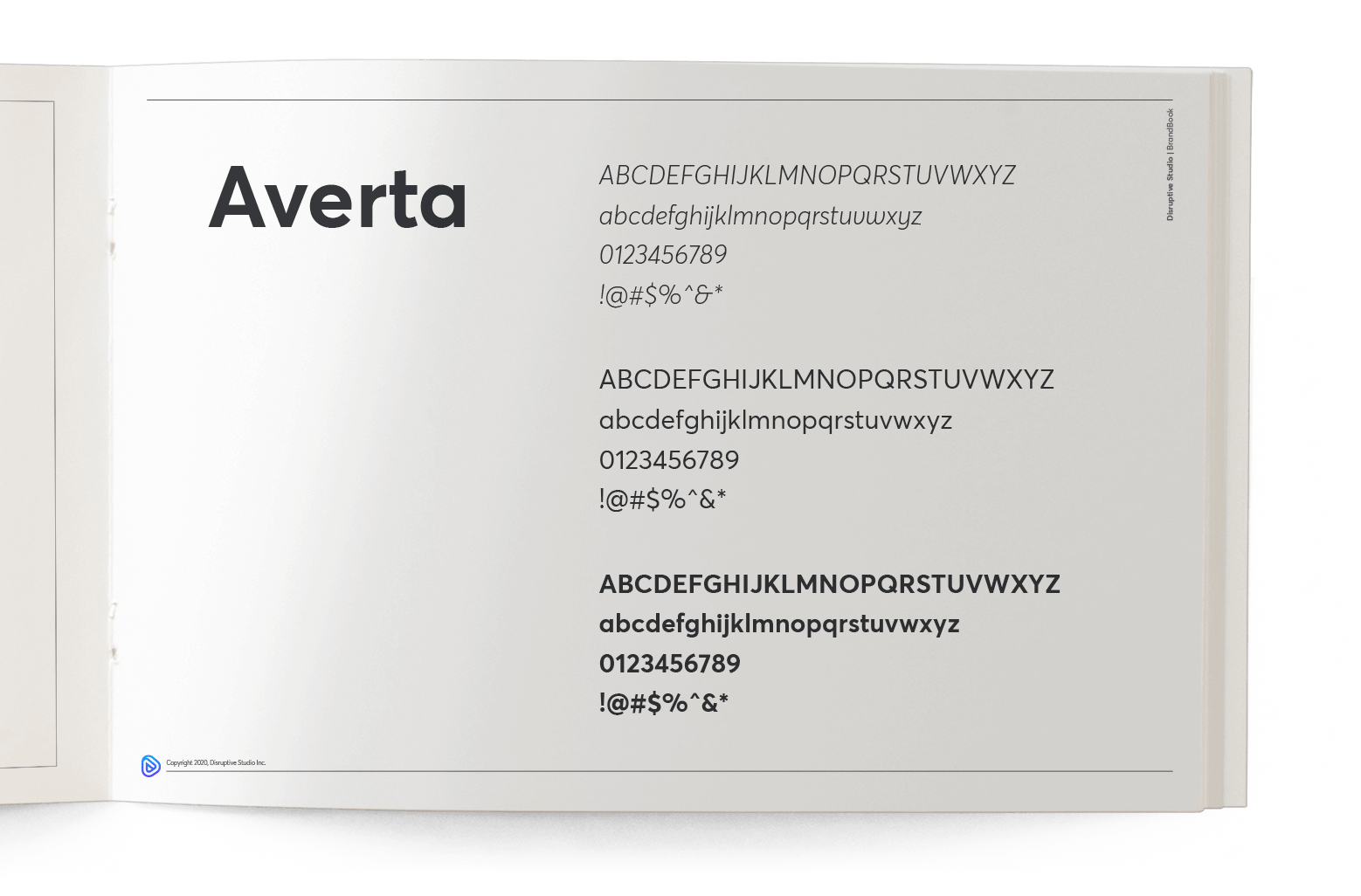
Typography is a very important element due to the fact that it must be adapted to the market it is supposed to attract. It must be functional, communicative, and must transmit what the brand wants to tell their clients.

We are here to help

We might save you hundreds of thousands of dollars in any project you might start. Contact us today.

Get Started